Laser engraved sign
Someone commissioned a photo sign of a pet. Mostly documenting this so I remember what settings I used!
Materials
- Piece of plywood, approx 12” x 8” x 0.5”
- Piece of 0.5” thick solid wood for the frame
- Wood stain for frame
- Spray finish - I used a glossy acrylic sealer
- Polyurethane finish for the frame
- A few nails
- Picture hanging hook
Prep Work
First step was to get a good photo to use, remove the background, and convert it to greyscale. Then adjust the levels and exposure until there is a really good contrast between the light and dark parts. The picture I had was fairly low resolution which wasn’t ideal, but it worked.
Once you have the photo, bring it into Lightburn and size it fairly small to do some test runs. I tried a variety of settings, and recorded the results. All of these were done with the bottom of the toolholder about 13mm above the work surface, and the laser mounted one set of screwholes up, and the laser focused into as tight a beam as I could get it. All were done with the Jarvis dithering option
| Speed | Power | Line Interval | Adjustments | Results |
|---|---|---|---|---|
| 2000 | 85 | 0.1mm | None | Completely burnt, no detail at all |
| 3000 | 85 | 0.1mm | None | Better, but looked very pixelated and not well focused |
| 3000 | 85 | 0.2mm | 0.75 gamma | A lot better. Still very pixelated looking |
| 4000 | 100 | 0.15mm | 0.75 gamma | Worse overall, but better in some ways. Probably shouldn’t change 3 variables at once. |
| 3000 | 100 | 0.2mm | 0.75 gamma | Very good, but the dithering is very noticable. |
| 4000 | 100 | 0.2mm | 0.75 gamma | Slightly too light in the darker regions |
| 4000 | 100 | 0.175mm | 0.75 gamma | Worse. Too many spots where the dots overlap |
| 4000 | 100 | 0.2mm | None | Best so far. At this point I increased the picture size to get a better idea what the full size version will look like. |
| 4000 | 100 | 0.2mm | None | Looks pretty good. Wood grain is really distracting but hopefully will be better in the full size version. |
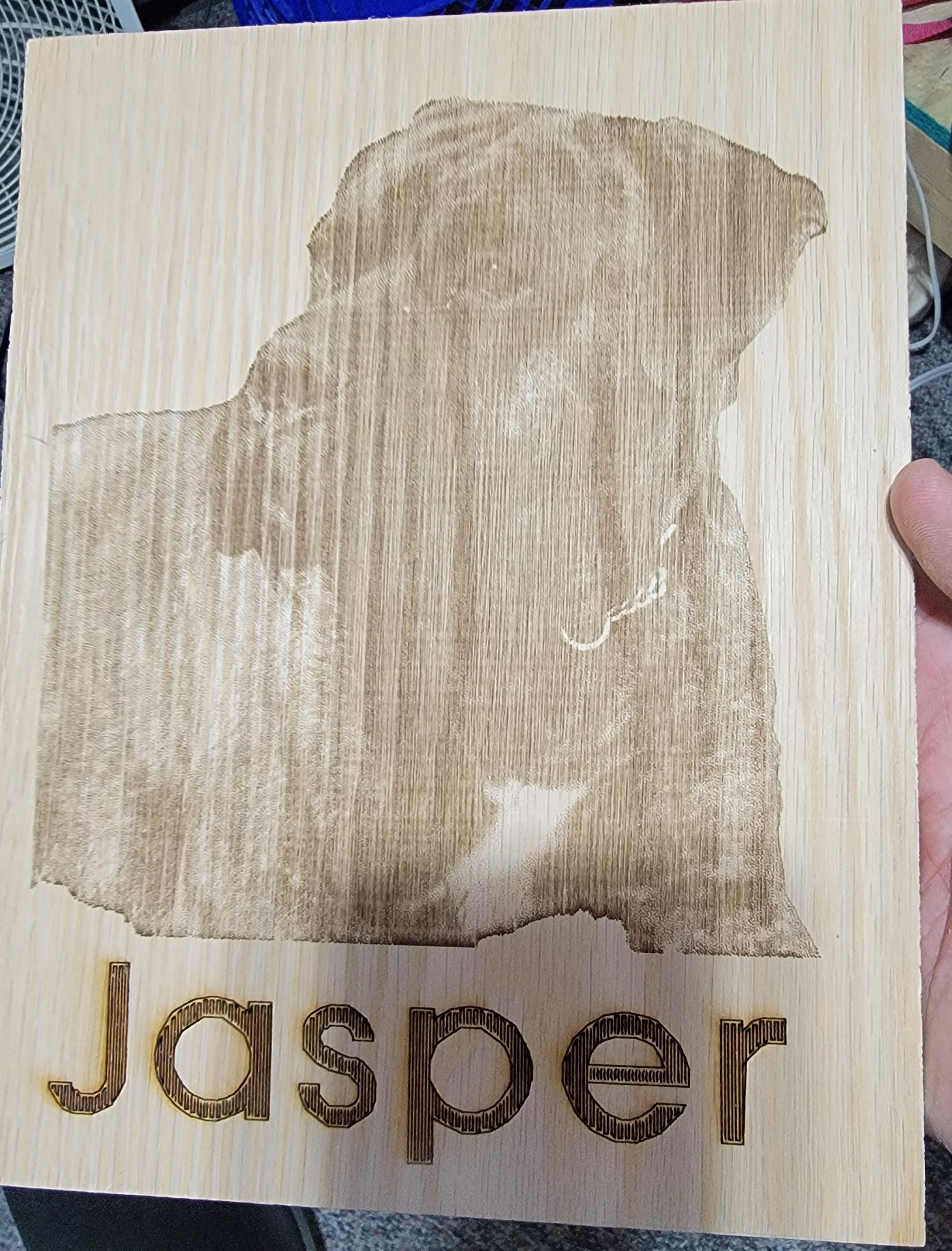
Final Burning
Burning the image and text took about 45 minutes. The name didn’t come out as dark as I would have liked, so I redid it a few times with slower speeds until it looked better. This is only possible if you haven’t moved the machine or the wood after the job finished, otherwise you’ll never get it lined up perfectly again. If I were doing it again, I’d pick a different font. The font I used was AGSFONT, which is a line based font ideal for plotters and lasers. It looked really good in the smaller sizes, but once blown up to full size the lines didn’t merge together anymore which I don’t really like.
Frame
The frame was made of a 1” strip of 1/2” thick pine. I cut the top and bottom pieces the same size was the sign, and the sides about an inch longer than the sides of the sign so they’d cover the top and bottom pieces. I intentionally left them a bit long just because I like the way that looks.
I sanded the pieces until they fit tightly around the sign, then they were stained with Minwax Red Oak stain and polyurethane. I used a prestain conditioner to help make the stain more even because pine doesn’t like to stain very evenly.
The sign itself I finished with glossy acrylic sealer, which changed the color of the wood in a way I really like. The nice thing about that spray is it dries really fast. The downside is it smells horrible.
To get the sign to be centered in the frame from front to back I sat it on a piece of 1/4” thick plywood while attaching the frame. The frame is just nailed in with 2 nails on each piece.
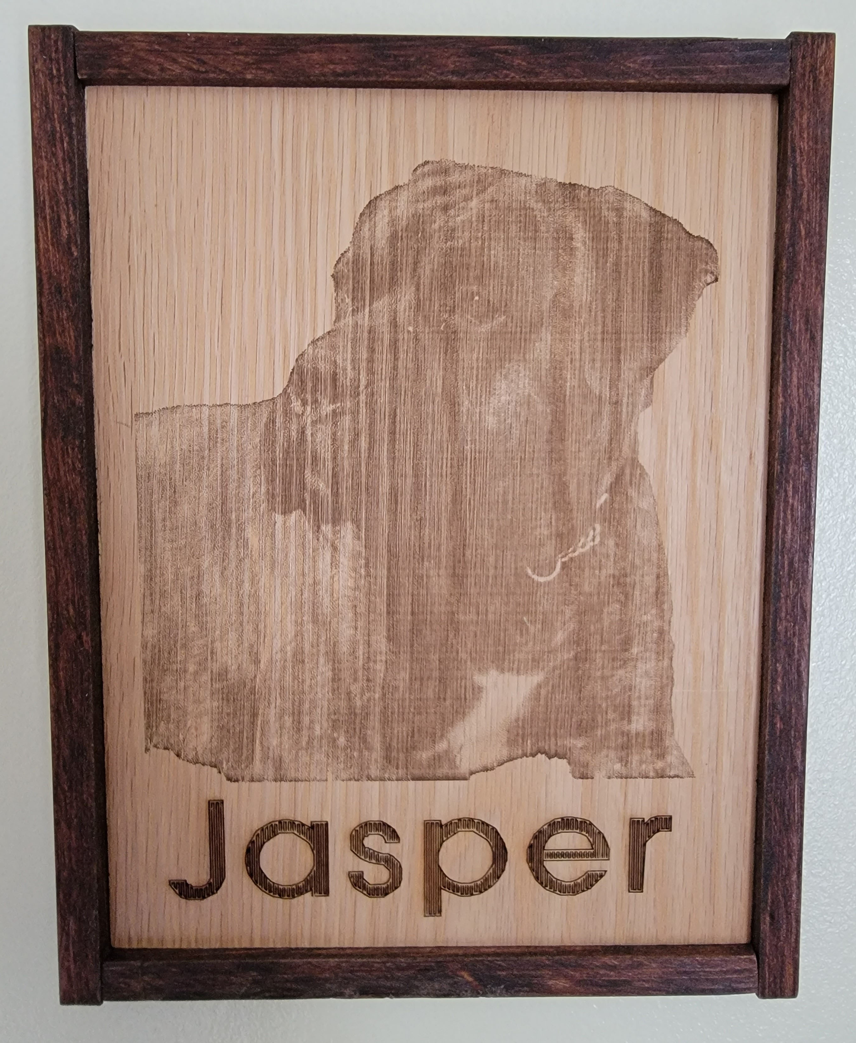
Once that was done I attached the hook on the back with 2 small screws, predrilling to make sure I didn’t mess up the wood.
Notes for next time
- Wish I had done a bit better job sanding and finishing the frame. But that’s always the way, isn’t it?
- Smaller nails, or dark colored ones, would have been nice - they wouldn’t stand out as much.
- Choose a better font and test it full size.
- Do this in nicer weather so I can use the spray finishes outside.